Life Remodeled Case Study
In Fall of 2020, we were given the opportunity to rebrand Life Remodeled, a non-profit organization dedicated to providing intentional and equitable opportunity for the people of Detroit. Over 15 weeks, our team worked to develop a branding system that could grow with Life Remodeled’s ever-expanding goals.
Research Phase
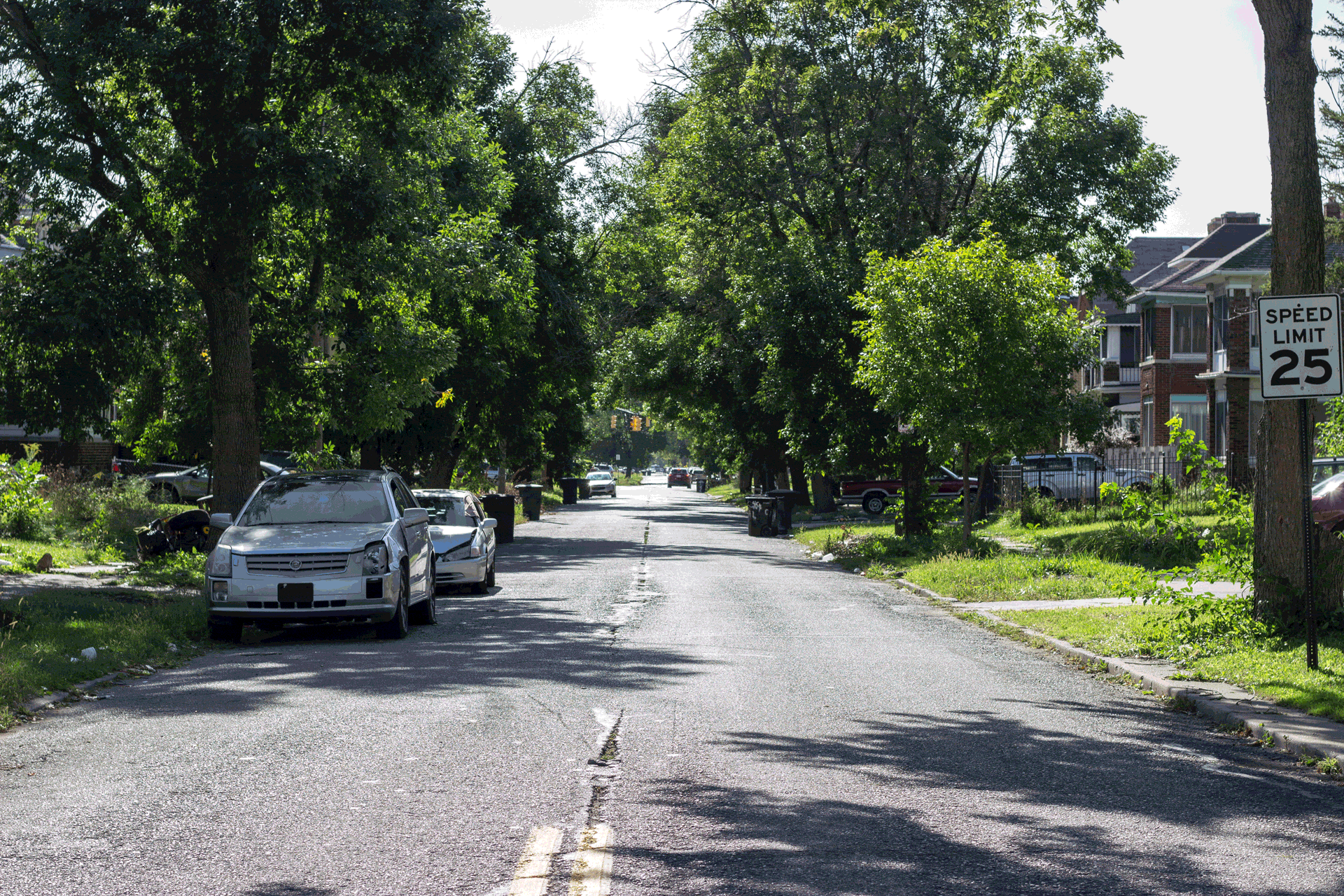
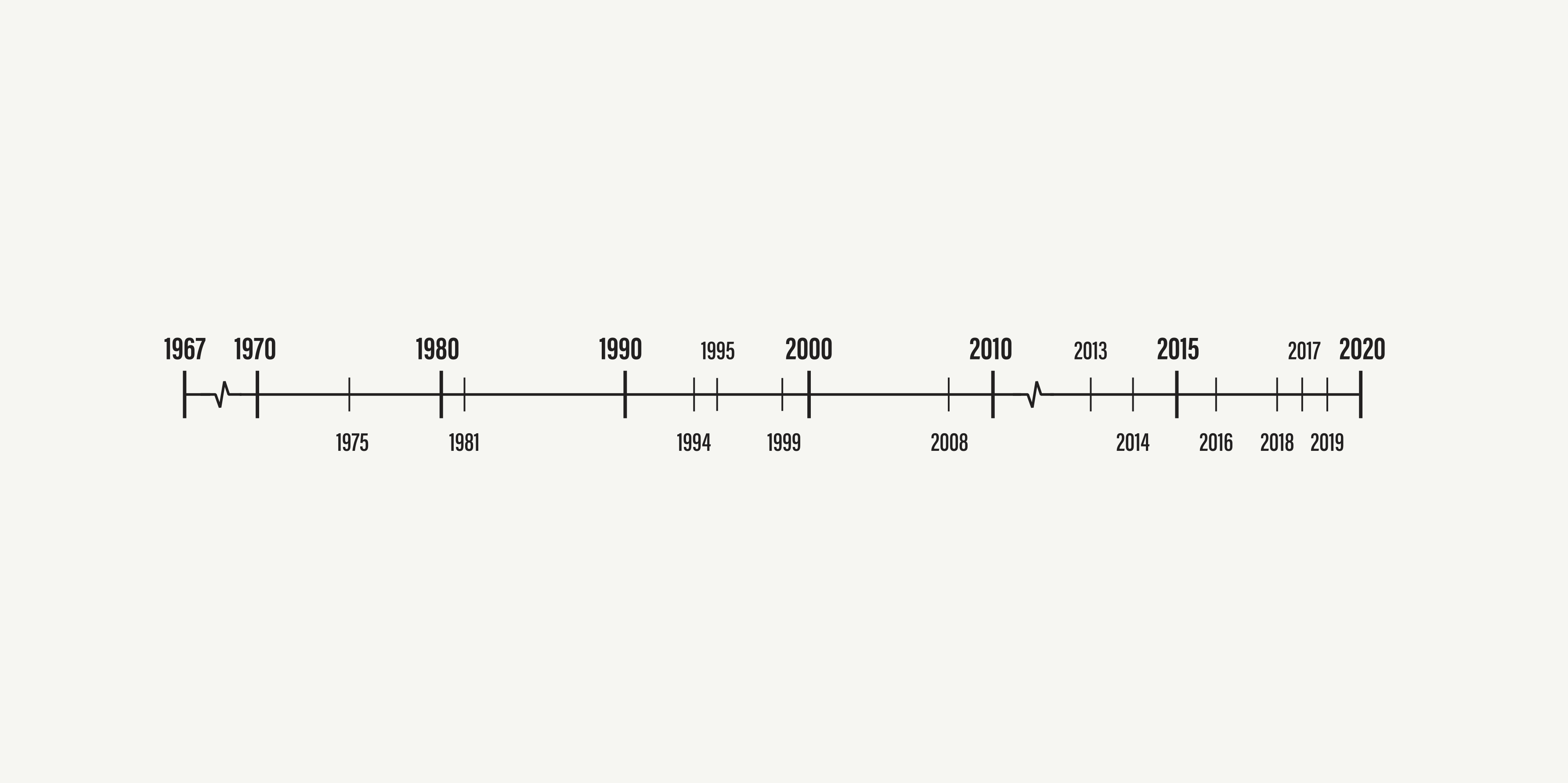
We began our research by trying to understand the landscape of Detroit today. To start, we took a deep dive into the city’s history post rebellion in 1967 to September 2020 by mapping out a timeline of significant events and changes in the city’s politics and economy. While doing so, we also took a quantitative lens by tracking the city’s population and poverty rate. When COVID-19 hit Detroit, Black neighborhoods were disproportionately affected and the unemployment rate skyrocketed. After the murder of George Floyd, protests happened across the country and through the streets of Detroit fighting against police brutality and systemic racism as a whole.
By analyzing how much systemic racism has shaped the structure of society, we were able to use that as a thread to identify 4 pillars to focus our research on Detroit—jobs, education, community development, and health and wellness. Our research required a lens of both quantitative and qualitative data ranging from looking into Detroit’s underfunded education system to core values of community development like equity and integrity.
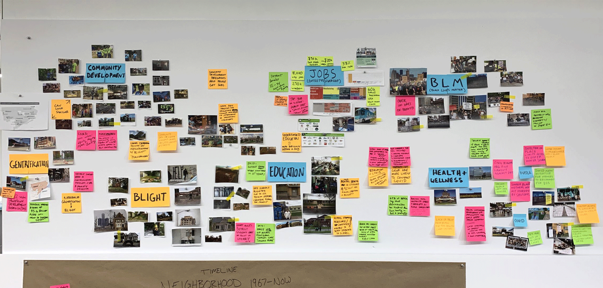
We took a multi-pronged approach to research, split between six other teams, to build a comprehensive understanding of Detroit and Life Remodeled. Through current brand analysis, case studies, ethnographic research, and a study on Detroit’s recent history (our team’s role) we presented a birdseye view back to the client to ensure we all had the same understanding of the weeks ahead.
Language Phase
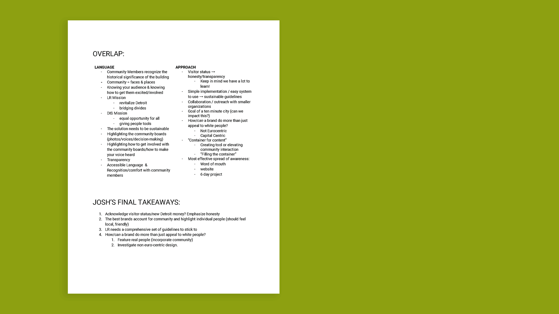
Following our research, we decided to take a step back and write a list of takeaways that could carry into our language phase and the fast approaching design phase. Once we were aligned as a group, we started a series of exercises to explore what Life Remodeled does and how to talk about it. Through a semantic differential, we recognized key characteristics like hope, familiarity, timelessness, and participation. From these broad words, we wrote the brand essence and a collection of promises as a way to turn abstraction actionable.
We are action-takers: to make effective and lasting change, we must channel the momentum of each neighborhood.
We are life-long learners: to grow with community members, we must recognize that learning is an ongoing process.
We are historically-conscious: to celebrate each neighborhood, we must honor their tradition, knowledge, and resilience.
We are practicing anti-racism: to uphold these promises, this effort must be at the core of everything we do.
Brand Essence
Radical hope, sustainable changePromises
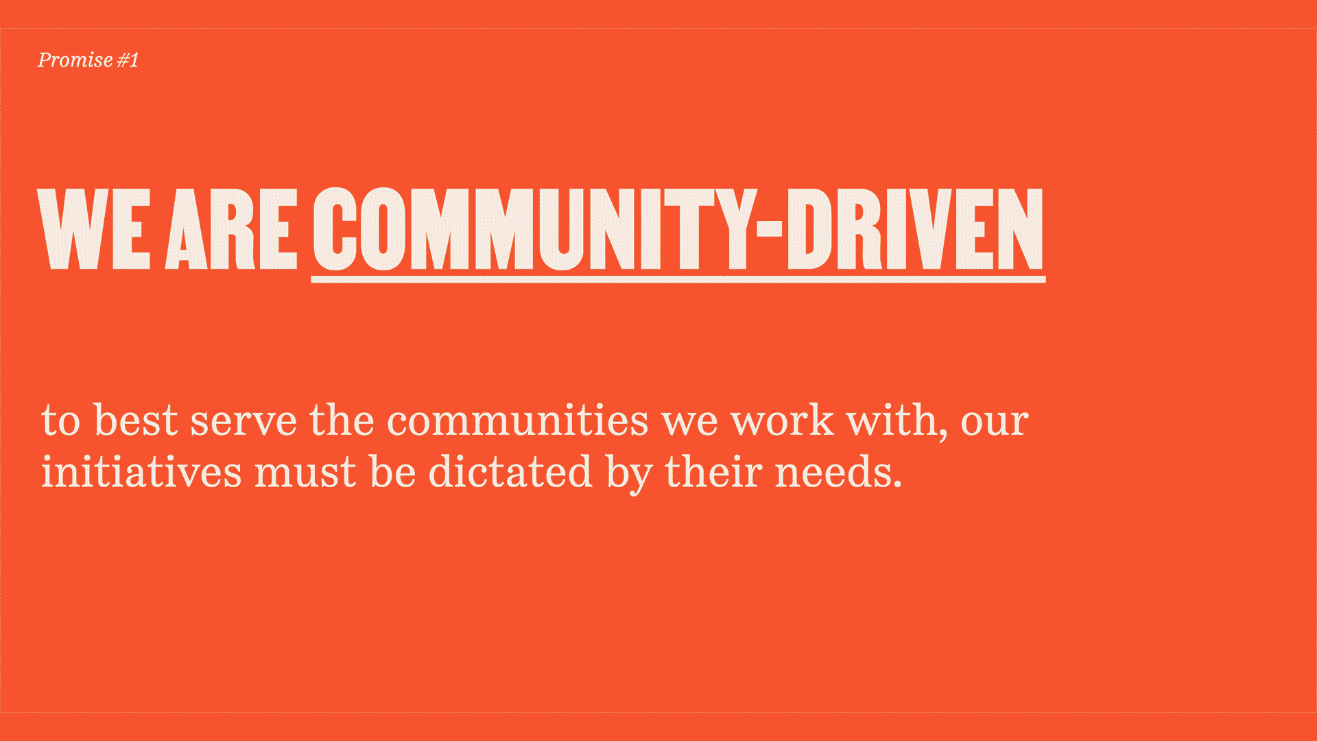
We are community-driven: to best serve the communities we work with, our initiatives must be guided by their goals.We are action-takers: to make effective and lasting change, we must channel the momentum of each neighborhood.
We are life-long learners: to grow with community members, we must recognize that learning is an ongoing process.
We are historically-conscious: to celebrate each neighborhood, we must honor their tradition, knowledge, and resilience.
We are practicing anti-racism: to uphold these promises, this effort must be at the core of everything we do.
Mood boards
While collecting imagery and case studies for our moodboards, we used these promises as a way to curate the content and support the language we developed. In our presentation to the client we were able to showcase tangible ways that language could translate to a design system.
Design Phase
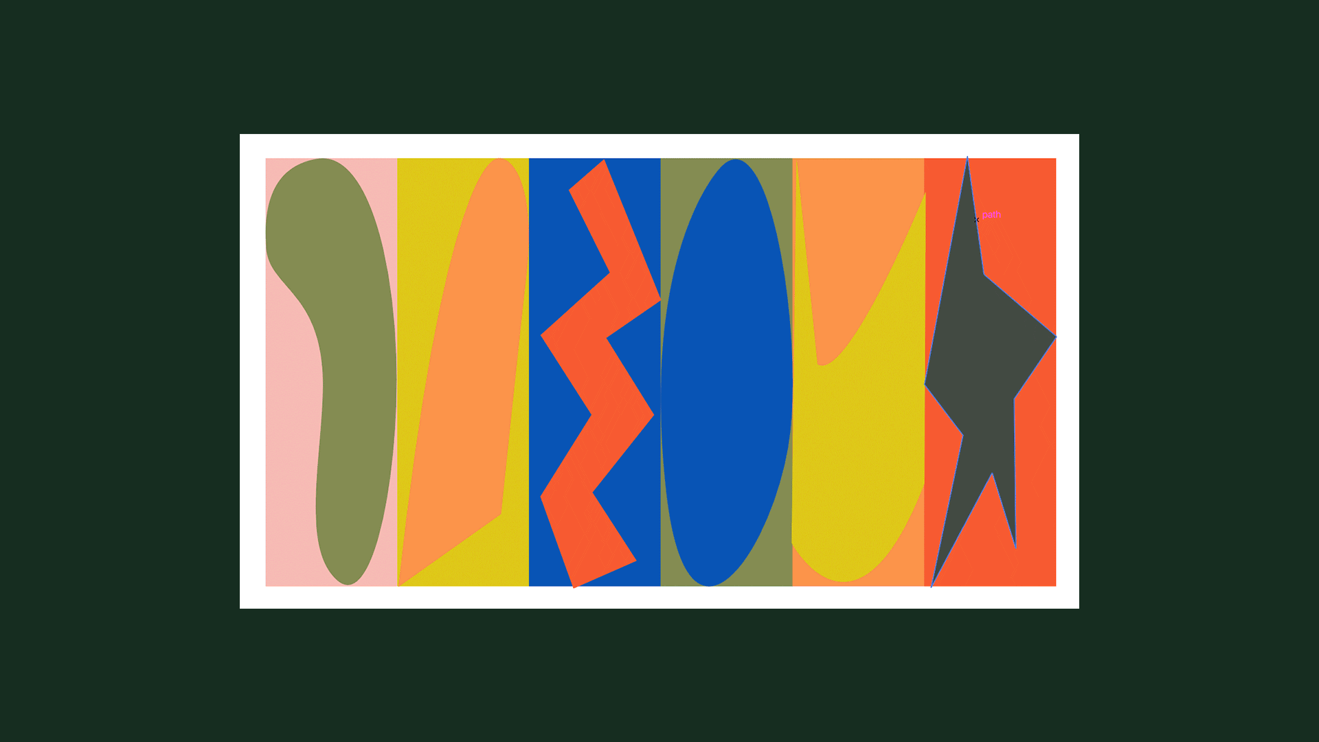
Perhaps one of the most challenging processes of developing the Life Remodeled brand system was its shape language. From the beginning, we knew form would be a powerful storytelling device, but defining its specific visual aesthetic took a lot of trial and error.
Denoting a home, a community, and upward movement, the final house shape worked both as a container for content as well as a standalone element. The archway, used for Durfee’s primary mark and a greater symbol representing future Opportunity Hubs and tenant-offered services, utilized similarly simple forms that were easy to implement, understand, and scale.
Denoting a home, a community, and upward movement, the final house shape worked both as a container for content as well as a standalone element. The archway, used for Durfee’s primary mark and a greater symbol representing future Opportunity Hubs and tenant-offered services, utilized similarly simple forms that were easy to implement, understand, and scale.

Color & Typography
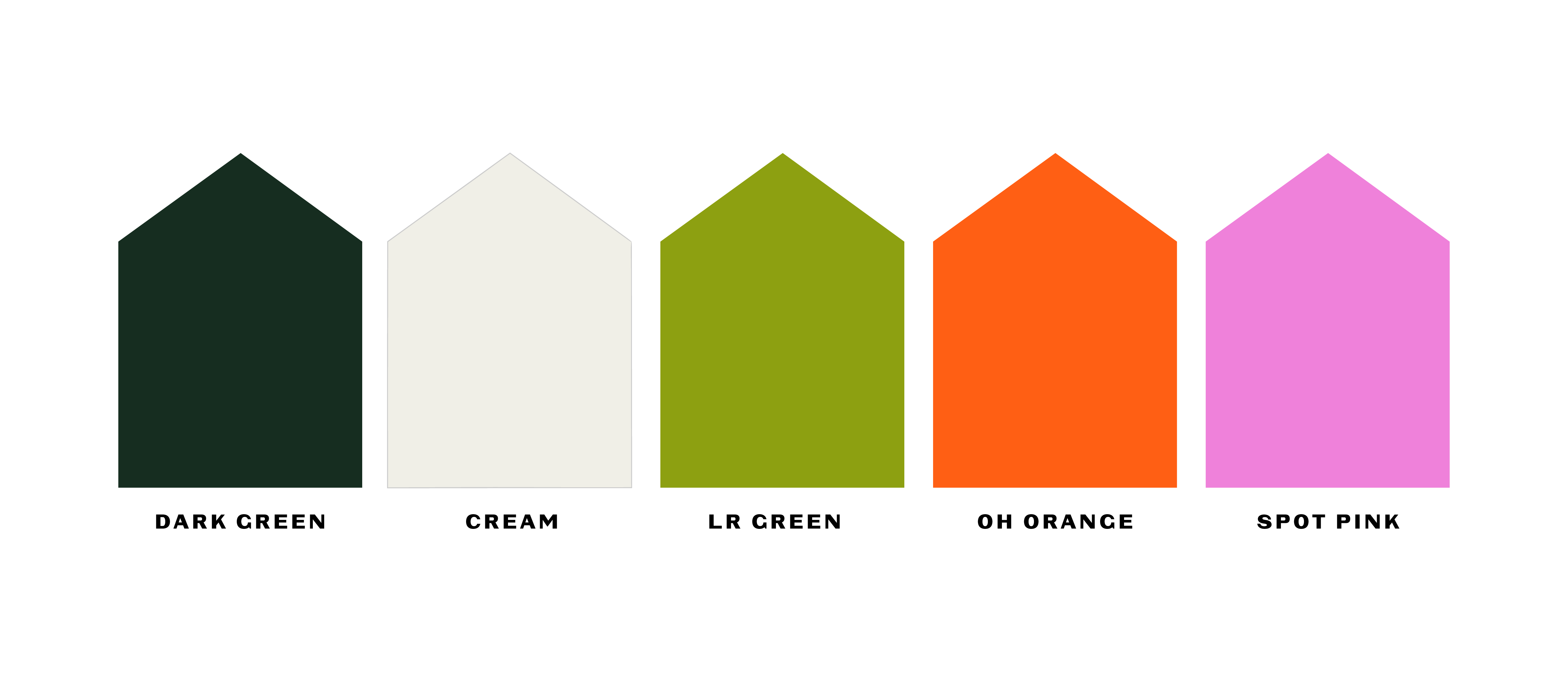
Life Remodeled’s original brand leaned heavily on the color green—a valuable piece of their existing identity that the community was already familiar and comfortable with. We determined right off the bat that it would be essential to retain some shade or hue of green as a primary identifier for the brand.
After weeks of testing and changing, we decided on a refined and more strategic palette than our intial attemps. Based in a dark, rich green as the key color for Life Remodeled in addition to a vivid orange for the Durfee Innovation Society, our final palette felt sophisticated yet versatile and well-rounded.
After weeks of testing and changing, we decided on a refined and more strategic palette than our intial attemps. Based in a dark, rich green as the key color for Life Remodeled in addition to a vivid orange for the Durfee Innovation Society, our final palette felt sophisticated yet versatile and well-rounded.
Typography was a driving force behind our system for Life Remodeled. Inspired by the icon “I am a Man” poster, we felt that Martin by Vocal Type Co. was historically informed and well-suited to the work that Life Remodeled did and would continue to do in the future. Bold, narrow, and powerful, Martin served as a workhorse for headlines and the primary identifier.
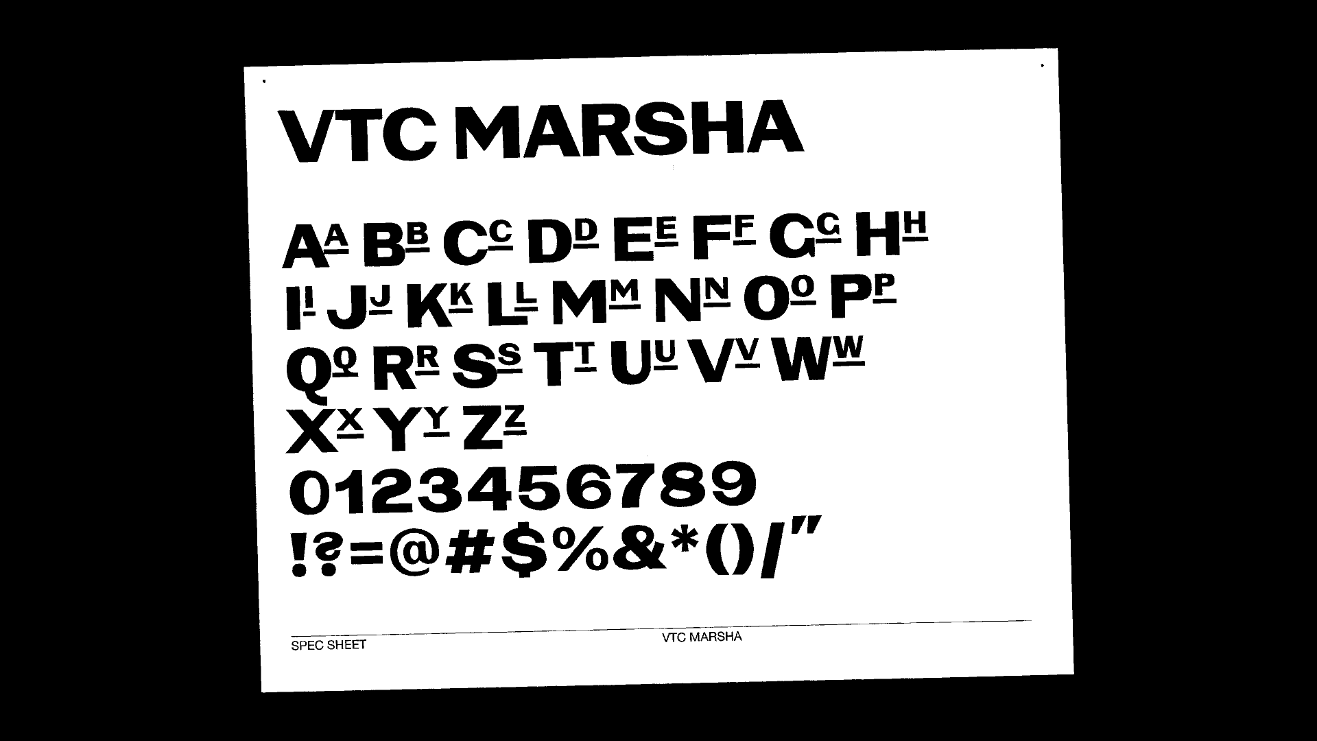
Marsha, also designed by Vocal Type Co., was used for subheads. It’s wider letterforms, in contrast to Martin, made language feel institutional, solid, and sturdy.
Marsha, also designed by Vocal Type Co., was used for subheads. It’s wider letterforms, in contrast to Martin, made language feel institutional, solid, and sturdy.
System in Motion
In our final design sprint, our attention switched from sole brand development to crafting a cohesive and compelling story that showcased what our Life Remodeled brand had to offer. Developing motion assets enabled us to illustrate the ideology behind our design decisions as well as demonstrate the modularity and variability of the solution we’d crafted. Our final presentation, which showcased a minute and a half of the system in motion, told the story of an individual, a community, and the tools they use everyday.